
Simple brands stand out
You may recall the brouhaha earlier in the year over Starbucks changing its logo to a simplified, less cluttered version. Out went its name and the word ‘coffee’ from its famous green mermaid-like logo.
Much of the fuss was over the question of whether people would still recognise its branding. Early resistance to the change was pretty strong, with comments on Facebook and Starbucks.com showing more than 10 to 1 against the re-design.
Despite this negative backdrop Starbucks knew it was the right thing to do because it is a path well-trodden by many companies that have over their lifetimes continously stripped down their logos to the very basics.
Nike, McDonald’s and Shell are just a small number of major names whose logos look very different to their early days and in many cases no longer include their actual name.
Clearly sucess and clean-looking uncluttered logos go hand in hand, which leads me to the question of why so many companies insist on having over complicated branding. Why go for less, when you can go for more seems to be the flawed thinking of many organisations.

The beer industry is just as guilty of too many over-complicated logos, even among the newer brewers on the block. You’d think the sensible route would be to start simple rather than spending loads of money on doing it much further down the line when the company has become rich and famous.
But the major benefit of simplicity is that it gives these new brewers standout on the bar and on the shelves of supermarkets and delis. Such is the high level of boring, me-too, and fussy designs of brewers logos and labels on bottles that those with clean lines really do look massively differentiated and are more likely to be singled out by the consumer for purchasing.
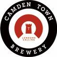
Some of the better examples to my mind are Otley Brewing Company of Wales, Kernel Brewery of South London and Camden Town Brewery of North London. They are also very contemporary in their styling.
The interesting aspect to the Camden Town logo is that it wasn’t the cheapest bit of designing ever. Jaspar Cuppaidge, owner of the brewery, admitted to having had four design companies (as well as members of his family) working on the logo at different times.
Amazingly, despite this amount of input it still remains a beacon of clarity. He wouldn’t, however, reveal how much the design work cost him.

In contrast, the logo and labelling for The Kernel Brewery undoubtedly cost its owner and brewer Evin O’Riordain very little indeed. To this most artisan of artisan brewers I suspect any expense on logos would have been regarded as a tad unnecessary. Taking this stance has helped create as basic (and visually appealing) a label as you are likely to see on any bottle of beer.
And isn’t this level of standout what it is all about.